Japanese industrial design 1960s-1980s
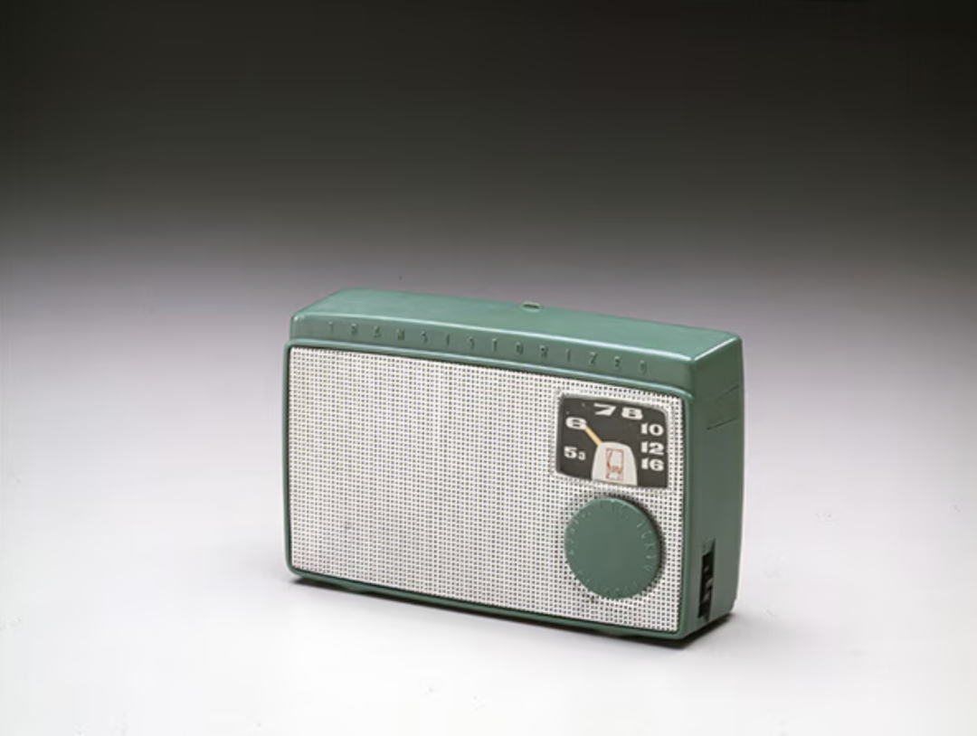
I recently read about how transistor technology enabled a whole new range of products, or at least the shrinking of products. Japan was an early adopter of transistors…
I recently read about how transistor technology enabled a whole new range of products, or at least the shrinking of products. Japan was an early adopter of transistors…
Tech is a sector that’s full of hype, and of utopian promises. Social media will revive democracy! AI will cure cancer and solve the climate crisis! Some of…

We hear a lot about user centered design, and human centered design, and occasionally about post human centered design: Ways to shift the thinking of designers to the…

We have a little kid, coming up on 3 years. Which means we have a lot of toys. Often, toys arrive with lots of little details attached. Then…

For an upcoming day of teaching I started compiling a list of resources relevant for the ethical, responsible development of tech, especially public interest tech. This list is…
Over the last few years, we have seen an explosion of new products and services that bridge the gap between the internet and the physical world: The Internet…
At SimplySecure’s excellent Underexposed conference we discussed the importance of making it easier for those involved in making connected products and services to make safe, secure, and privacy-conscious…